How to Match Thread Color to Design: Here’s How
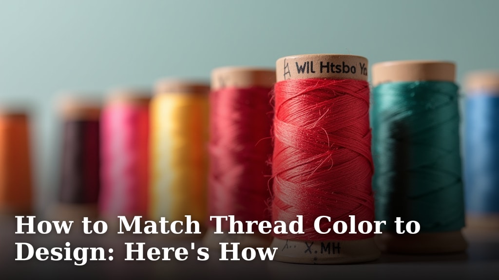
Matching thread color to your design is easier than you might think. The best way to match thread color is by holding a physical thread sample directly against your fabric or design. This helps you see the true color in your lighting conditions. Looking at digital swatches can be misleading because screen colors vary greatly. You want to ensure your thread perfectly complements your project’s colors.
Selecting the right thread color makes a huge difference. It can make your stitches blend in seamlessly or stand out boldly. We’ve researched the common pitfalls people face. Many shoppers struggle with online color matching. They end up with thread that looks different in real life. Trusting your eyes with physical samples is key for a successful outcome.
- Hold thread samples against your fabric.
- Consider your lighting conditions.
- Digital swatches can be unreliable.
- Physical comparison is the most accurate method.
- Good color matching enhances your design.
Let’s walk through exactly how to pick the perfect thread color for your next project, step by step. Our guide to thread for machine embroidery covers essential choices.
Getting Your Thread Color Right for Any Project
Choosing the correct thread color is like picking the perfect accessory for an outfit. It can either tie everything together beautifully or stick out like a sore thumb. We understand the struggle. So many people get it wrong. They end up with a project that just doesn’t look quite right. Let’s make sure that doesn’t happen to you.
The Power of Physical Thread Samples
You’ve heard it before, but it bears repeating: hold the thread against the fabric. This is the golden rule. Digital screens are tricky. Your computer or phone might show colors differently than someone else’s. Even the same screen can show colors differently depending on your room’s lighting. Holding the actual thread sample lets you see its true hue. You can assess how it interacts with the fabric’s texture and color under your specific lighting.
Why Digital Swatches Can Fool You
Online shopping is convenient, but it comes with challenges. Thread colors online are often displayed on digital swatches. These are digital representations. They are not the actual thread. Factors like monitor calibration, screen brightness, and even the background color used on the website can alter your perception of the color. We found that many online stores do a decent job, but there’s always a risk. It’s like ordering a paint color online without a sample chip. You might be surprised when it arrives. Learn more about cotton embroidery thread and its properties.
Understanding Your Lighting Conditions
Your sewing space likely has a specific type of lighting. Is it bright overhead fluorescent lights? Is it a warm, soft lamp? Or do you rely mostly on natural daylight? Different light sources affect how colors appear. Natural daylight is generally considered the most accurate for color matching. However, many of us sew at night or in rooms with artificial light. Consider your typical sewing environment. Take your thread samples and fabric there before making a final decision. This helps avoid surprises later.
The Fabric Matters, Too
The color of your fabric plays a huge role. Is it a light, airy linen? Or a dark, dense velvet? The fabric’s color and texture can influence how the thread color appears. A bright red thread might look vibrant on white cotton. But on a deep navy blue fabric, that same red might appear muted or even shift in tone. We suggest laying the thread sample flat on the fabric. Then, look at it from different angles and in different lights. This helps you see how the thread will actually look when stitched.
Matching Thread: Strategies and Techniques
Now that we understand the basics, let’s talk strategies. Do you want your stitches to be invisible or a prominent design element? Your goal will guide your color choice.
The “Blend In” Approach
Sometimes, you want your stitching to be subtle. Perhaps you’re quilting a complex pattern. You want the quilt design itself to shine. In this case, you’ll want a thread color that is as close as possible to your fabric.
Matching Fabric Color
For this approach, find a thread that matches your fabric almost exactly. This is easiest with solid-colored fabrics. You can often find a thread within the same brand that is labeled as a perfect match. If you can’t find an exact match, choose a thread that is one or two shades darker than your fabric. A slightly darker shade tends to disappear better than a lighter one. Lighter threads can stand out more on darker fabrics.
Matching a Specific Color in a Print
If your fabric has a print, you’ll want to match the dominant color in the print. Or, you might want to match a less dominant color for a subtle contrast. Carefully examine the different colors in your fabric. Use your thread samples to see which one best disappears into the pattern. Many experts recommend looking at the print from a distance. This helps you see the overall color effect. Then, find a thread that matches that perceived color.
The “Stand Out” Approach
Other times, you want your stitching to be a feature. Think decorative embroidery or bold quilting lines. Here, you want a thread that contrasts with your fabric.
Choosing a Contrasting Color
Contrasting colors create visual interest. A common technique is to use the complementary color. This is the color opposite yours on the color wheel. For example, blue’s complement is orange, and red’s is green. Using a complementary color can make your stitches pop. Consider the mood you want to create. A bright, bold contrast creates energy. A softer contrast can be elegant.
Using a Lighter or Darker Shade
You don’t always need a dramatic color shift. Simply choosing a thread that is several shades lighter or darker than your fabric can provide enough contrast. For instance, on a medium gray fabric, a charcoal gray thread or a light silver thread would stand out nicely. This is a more subtle way to make your stitches noticeable without being overpowering.
Metallic and Specialty Threads
Don’t forget about specialty threads! Metallic threads can add a touch of sparkle and sophistication. Variegated threads, which change color along their length, can add a unique, dynamic effect to your stitching. These often look best when you have a simpler fabric background. They can sometimes compete with busy prints. We’ve found they work wonders for adding that extra ‘wow’ factor.
Common Thread Color Matching Pitfalls to Avoid
Even with the best intentions, mistakes can happen. Here are some common traps we’ve seen people fall into, and how to steer clear of them.
Ignoring Fabric Sheen and Texture
A shiny satin fabric will reflect light differently than a matte cotton. A fuzzy flannel will absorb light. This can make the same thread color look different on different textures. Always test your thread on the actual fabric type you are using. A thread that looks perfect on a swatch might get lost or appear too stark on the final material.
Over-reliance on Online Recommendations
Many sewing machine manufacturers and thread companies offer online color matching tools. While these can be a starting point, they are not foolproof. They often rely on generic color profiles. They can’t account for your unique lighting or fabric. Use these tools as a guide, not a definitive answer. Always follow up with a physical comparison.
Not Considering the Project’s Overall Design
Think about the entire project. If you’re making a multi-colored quilt, what color thread best supports the whole picture? If you’re embroidering a design onto a garment, will the thread color clash with the garment’s main color? It’s not just about matching the immediate fabric. It’s about how the thread integrates with all elements of your creation.
Buying Too Little Thread
This isn’t strictly a color matching issue, but it’s related. If you find a thread you love, buy enough! Running out mid-project and then trying to find the exact same dye lot can be impossible. Dye lots can vary slightly. Always purchase more than you think you’ll need. This ensures consistency if you do need to do more stitching.
Your Thread Color Matching Checklist
Ready to get your thread color just right? Follow these quick steps:
- Hold the thread sample against your fabric.
- Check the color in your normal sewing light.
- Consider if you want stitches to blend or contrast.
- Test on a scrap piece if possible.
- When in doubt, go slightly darker for blending.
- Buy more thread than you think you’ll need.
Special Considerations for Different Projects
The best thread matching strategy can vary depending on what you’re making. Here’s a quick look at a few common scenarios.
Quilting
For quilting, thread can be functional or decorative. If you’re doing intricate quilting that you want to highlight, choose a thread that contrasts with your fabric. A medium gray thread on a light pastel fabric can look stunning. If you want the quilting to disappear into the background, match your fabric color as closely as possible. Many quilters suggest using a neutral gray or beige if an exact match is difficult. These colors tend to blend well across a range of fabrics.
Embroidery
Embroidery often involves multiple colors. For machine embroidery, you’ll typically match the thread to the color in your embroidery design file. For hand embroidery, you have more freedom. You might match a color in the design for a subtle look, or choose a contrasting color to make the stitches pop. Consider the fabric the embroidery will be on. A bold silk might handle brighter threads than a delicate voile.
Garment Sewing
When sewing garments, the thread usually needs to blend in. You want the garment’s fabric and style to be the focus. Match the thread to the dominant color of the fabric. If the fabric has a subtle texture or pattern, a thread that matches the darkest or most prominent color usually works best. It’s rare to want your garment stitching to stand out significantly unless it’s part of a specific design choice, like decorative topstitching.
Home Decor
Projects like pillows, curtains, or upholstery can go either way. For functional seams, you’ll want the thread to disappear. Match the fabric color closely. If you’re adding decorative stitching, like piping or accent seams, then contrast can be a great choice. Think about the overall style of the room. A modern room might call for clean, contrasting lines. A more traditional space might prefer subtle blending.
| Project Type | Goal | Best Thread Strategy |
|---|---|---|
| Quilting (Highlighting Stitches) | Make stitches prominent | Choose a contrasting color (lighter, darker, or complementary) |
| Quilting (Blending In) | Make stitches invisible | Match fabric color as closely as possible; use neutral if unsure |
| Embroidery (Design Color) | Enhance the embroidered design | Match the color within the design file or pattern |
| Garment Sewing (Seams) | Functional, invisible stitching | Match the fabric color; darkest color in a print if unsure |
| Home Decor (Accents) | Add decorative detail | Use contrasting colors for visual interest |
Final Thoughts on Picking Your Perfect Hue
Taking a few extra moments to properly match your thread color can transform your project. It shows attention to detail. It makes your finished item look polished and professional. Remember to trust your eyes over your screen. Your lighting is key. And don’t be afraid to experiment with subtle contrasts. Happy stitching!
Conclusion
You’ve learned how vital thread color matching is for a polished project. Remember, the best way to ensure accuracy is by holding thread samples against your fabric in your own lighting. Digital screens can be deceiving, so trust your eyes. Whether you want your stitches to blend in or stand out, you now have the strategies to choose the perfect hue. Take these tips with you to your next sewing project. Your finished items will thank you for the attention to detail.
Frequently Asked Questions
What’s the best way to check thread color if I can’t get a physical sample?
If getting a physical sample is impossible, try to find high-quality photos of the thread on a neutral background. Look for multiple photos if available. Cross-reference with reviews or ask customer service if they can provide more context. You can also use your monitor’s color settings to adjust for brightness and contrast, but this is less reliable than a physical sample.
Can I use a dark neutral thread to blend with almost any fabric?
Yes, a dark neutral like charcoal gray or a deep taupe can often blend well, especially on darker or medium-toned fabrics. However, on very light or brightly colored fabrics, a dark neutral might still stand out more than you’d like. It’s usually best to aim for the closest possible match when blending is the goal.
How do I match thread to a busy patterned fabric?
For busy patterns, look at the fabric from a distance to see the overall color impression. Then, try to match one of the dominant colors in the pattern. Alternatively, pick a neutral thread color that appears in the pattern or a subtle contrasting color that complements the main colors. Holding thread samples directly over the pattern is key here.
Should I use the same thread color for topstitching as for regular seams?
Generally, for garment sewing, you’ll want your regular seams to blend in. Topstitching is often a decorative element, so you might choose a contrasting thread to make it stand out. Consider the overall design and aesthetic you’re aiming for. Sometimes, a slightly different shade of the same color can provide a subtle contrast for topstitching.
What if my fabric has a sheen, like satin or silk?
Fabrics with a sheen reflect light differently. A thread that looks perfect on a matte fabric might appear too bright or stark on satin. Always test your thread on a scrap of the actual fabric. You might need to choose a slightly darker or less vibrant thread to account for the fabric’s shine and to ensure it doesn’t overpower the material.